


Four Sisters
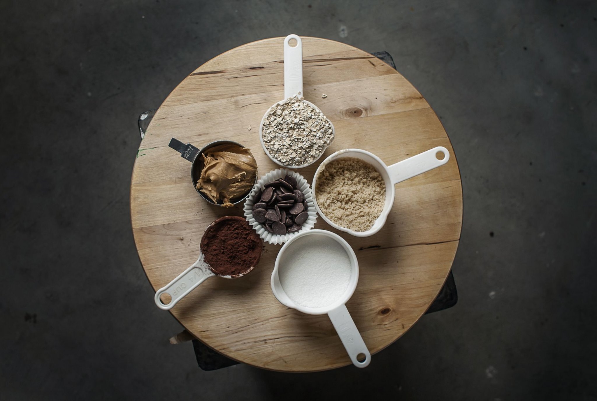
Four Sisters Specialty Foods produces homemade granola clusters made in small batches. Their unique, oatmeal cookie-like granola clusters are an evolution in shape and taste from typical grocery granola. The name 4 Sisters is a riff on the 3 Sisters Lighthouses of Cape Cod where their business is based—the business is also owned and operated by 4 sisters. We created a brand and design system to work on a variety of flavors and product types. Their extraordinary lineup of treats includes four varieties—Original, Midnight Chocolate, Snappy Ginger, and Perfect Duo. The logo is an interlocked 4 and capital 'S'. The 'S' weaves in and out of the number 4 reflecting a melding of ingredients, inspiration, and taste. Customized typographical elements add a contemporary feel to the timeless mark. The color palette is product specific, vibrant, and flavorful. We brought a new visual design to this product and moved it away from the "granola", transforming it into something that stimulates new tastes and a fresh perspective on specialty food packaging.